Marketing Volatility – A Tendency to Oversimplify
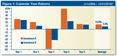
Take a look at the following chart:
It’s taken from a recent MainStay Investments piece on volatility. MainStay uses this chart and two others to point out why volatility (standard deviation) matters: despite a significantly higher average annual return (12.6% vs. 7.3%), Investment A underperforms the more-stable Investment B in terms of 5-year total return to the tune of about 9%.
The piece is solid overall. It’s both concise (1 page) and visual (graphics communicate the message). However, I think it also illustrates one of the pitfalls in talking about volatility: oversimplification.
In MainStay’s example, the more volatile product delivers lesser performance. Pointing out the potential pitfalls of looking at average annual returns is ok, but I don’t think a thoughtful investor/advisor is truly challenged by the conclusion here. They can get lower volatility and a better return with the same product. It’s a slam dunk.
But a simple, minor shift in the data creates a much different conversation. For example, what if the Year 3 return for Investment A was -53% (instead of -58%)? In this case, Investment A delivers excess total return of about 4% over the 5-year period, but with twice the volatility. Now we have an interesting discussion. Should people forgo the extra return for a smoother ride?
In these more complicated scenarios is where the illuminating conversations about volatility can be had. As firms continue to incorporate volatility into marketing messages, especially with alternatives, I suspect that the most successful ones will be those that most deeply explore the details of how volatility really matters.
More on volatility later this week…


