AB

Best Blogs of the Week vol. 181

7 excellent posts from the last two weeks.

Best Blogs of the Week vol. 178

Helpful financial advisor content this week all around (tough to narrow the choices down). Four posts we thought were particularly helpful.

2014: A Year of Blogs (Part I)

In 2014, we reviewed over 1,500 individual blog posts to create the Best Blogs of the Week. In reviewing that volume, we identified five best practices consistent across the best posts. These practices range from the obvious to the counter-intuitive. Before we delve into the best practices, we need to agree on asset managers’ broad goals for an in-house blog. Broadly, marketers reference driving brand loyalty and increasing awareness as the two most frequent blog goals. With that in mind, we highlight best practices supporting these two goals.

Best Practice I – Get the Basics Right

Everyone intends to get the basics right; yet many firms continue to ignore or simply struggle with them. The basics are:

  1. Indicate the author
  2. Use a modern design
  3. Provide limited and pertinent tags
  4. Ensure readability via mobile devices

Author

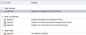
Each blog post must indicate the author’s name, provide a photo and allow the reader to see his/her other posts. BlackRock gets it right with the left-hand rail available in each post. Alpholio (right-hand side) provides no names.

BlackRockAlpholio


Modern Design

The blog must use large fonts, multiple high-quality graphics, and an engaging color palette (all easier said than done). Natixis uses bold, contrasting colors with large fonts and easy access to social media, while JPMorgan relies on a more conservative approach with small fonts, limited graphics, and a continuous stream-of-conscious look.

ngam jpm

Tagging

Tags are highly subjective. Some firms use no tags while others exceed 30+ (therefore categorizing posts into too many small groups). 10 is probably a good upper bound; AllianceBernstein sets a good example with 10 straightforward tags (We do come across “General” or “Markets” a bit too often.).

AB

Mobile Readability

Many FAs will use their phones and tablets to scroll through posts while idle (e.g., sitting in traffic), so ensuring clear readability and expandable graphics remain critical.