Can We Make Data More Digestible?
25 home runs. 100 runs batted in. A .293 batting average.
Those data points, in part, summarize the 2016 baseball season of Jose Abreu, the best offensive player on my favorite team, the Chicago White Sox. Baseball has undergone a huge statistical revolution over the last 20 years. I chose three very traditional data points for Abreu, but the fact is there are literally hundreds of individual stats tracked for players these days.
All of that data is well and good, but digesting it can lead to a very simple question: just how good was Jose Abreu in 2016? It turns out there’s a clear answer to that question, because one thing baseball has done very well is simplify complex data.
For example, there’s a statistic called Weighted Runs Created Plus, or wRC+. It summarizes a player’s entire offensive value in a single number. Without diving into the technical details, two things make wRC+ very effective:
- It adjusts for context. Specifically it adjusts results based on (a) league-wide averages, and (b) the stadium the player plays in (since some are more or less friendly for offense than others).
- It summarizes everything in a SINGLE number. A wRC+ value of 100 represents league average. Every point above or below that represents a result that is 1% better or worse than average. So, Abreu’s wRC+ of 118 means he was 18% better than the average offensive player last season.
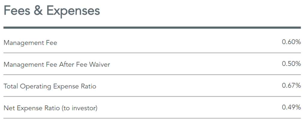
That’s a lot of baseball… what’s the point? Simply put, I think baseball’s ability to present data in a digestible manner has potential for asset management. Consider expenses as an example. A common presentation is to present expense ratios directly, as Dimensional Fund Advisors does here:
But how much does that really help? Sure knowledgeable investors and advisors have a good notion of what is high or low when it comes to fees, but not in any systematic or (frequently) very precise way.
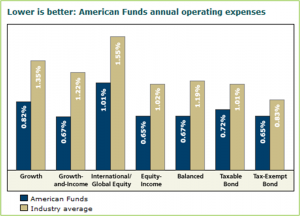
Providing category or peer data alongside that, as Morningstar and some managers do, certainly helps. But even there an investor or advisor is left to mentally digest the scale of the difference.
So what if data like expense ratios was represented via a more comprehensive statistic that combines product-specific and category-average data into a single number scaled against 100, much like wRC+? Let’s call it the “Expense Index.” For the DFA fund noted above, the Expense Index would be 38, immediately communicating that the fund’s expense ratio is 62% lower than its peer group.
I can envision many applications for this type of normalized data. Of course there are questions. For example, without an external / regulatory requirement would firms want to be so direct, especially with data like fees? I mean, many would want to avoid showing an Expense Index of 150.
So there is some thinking to be done on what information is most conducive to such an approach. Even so, simplifying and providing context around data strikes me as an opportunity worth of more exploration.


