infographics

Improve Your Blog (3 of 5)

In the last year, industry blogs have improved dramatically. We’ve seen firms inject personality (our first part in this series) and increase the frequency of posts (our second part in this series). This post covers including graphics (not stock photography).

Most blog posts topics cover (or begin with) macroeconomic issues. That makes sense for a few reasons. First, macroeconomic issues don’t worry compliance too much. An analysis of Greek debt has no inherent product push or firm advertisement. Second, investment teams are (often) analyzing big themes for investment opportunities, so the blog post can be a natural output from the analysis.

Yet, many of these macroeconomic blog posts are solely prose. We think that’s a mistake. One or two straightforward graphics enable the viewer to understand the author’s perspective and quickly decide to read (or not) the prose. A well-placed graphic increases the likelihood a blog post is read (especially when the post is more than 1 – 2 paragraphs).

 … [read more]

A Picture is Worth 978 Words

Two weeks ago we did a presentation for a client on infographics – what they are, how they can be used, the process for creating them, and some strong examples from asset management. With that discussion fresh in my mind, I read Richard Thaler’s article from last Saturday’s New York Times.

Thaler, whose work I really admire, writes about how the government, companies, and individuals are paralyzed by the current financial climate and holding off on investments they should make now. In other words, those that control the purse strings have become proverbial deer-in-the-headlights.

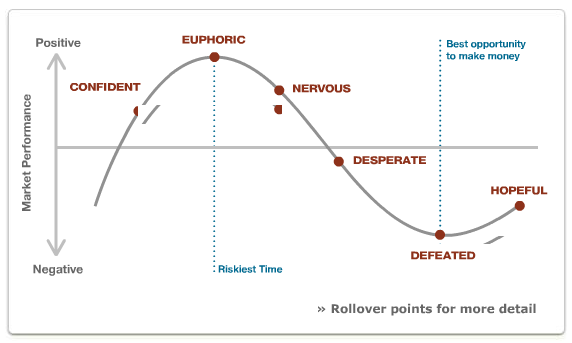
It’s a solid argument, and Thaler takes 978 words to make it. As I finished the article, I immediately thought of an interactive infographic from John Hancock Funds’ Web site.

This shows the beauty of even a simple infographic. Though Hancock’s message differs from Thaler’s – the focus is on people’s willingness to invest in securities based on recent market performance – they tell a similar story with a visual and 10% of the word count.

The natural communication approach for most asset managers involves charts and tables surrounded by paragraphs of text. This example shows that better options are out there.